“Do you have what I want? Why should I get it from you?” If eCommerce landing pages could speak, this is exactly what the pages would convey!
This line by Landing Page Optimization: The Definitive Guide to Testing and Tuning for Conversions says almost everything there is to say about eCommerce landing pages.
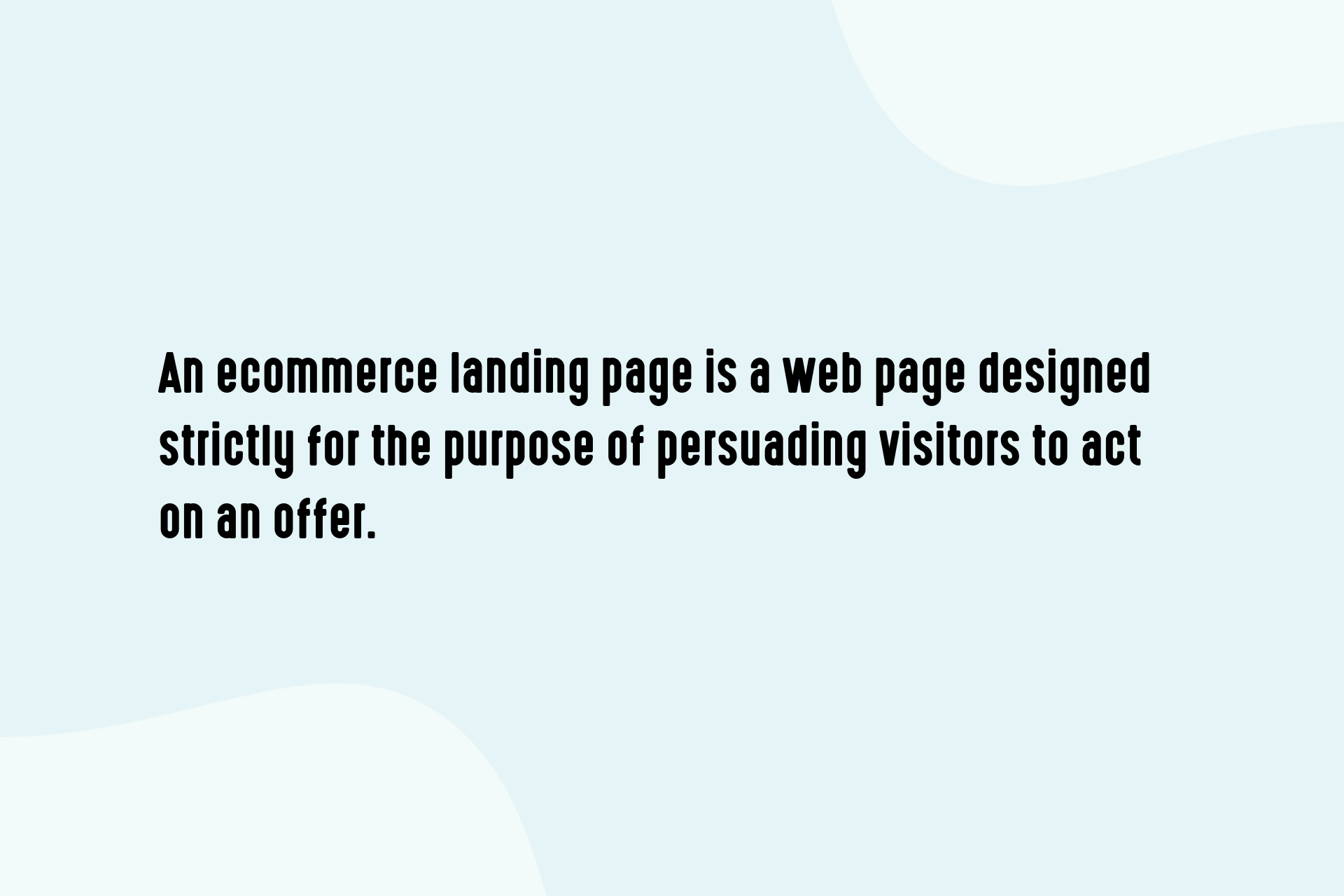
What are eCommerce landing pages?
In layman terms, eCommerce landing pages are web pages where a (potential) customer “lands” in response to their click on an online advertisement, marketing promotion or Google Ad Word.
According to Instapage
The page directs the customer to the exact sales path with a dedicated Call To Action (CTA). The page is usually linked to social media sites or search engine marketing campaigns.
This helps in increasing the reach and effectiveness of the advertisements. The focus of a landing page is to build a lead generating site by converting idle visitors into leads thereby driving more sales.
While obtaining a lead, eCommerce landing pages usually enquire for a phone number or email address of the visitor at the very least.
More detailed information may be required based on the requirement of the business.
At the point of sale, the landing page should include a CTA which directs the customer to a shopping cart or a checkout area.
As mentioned by Tim Ash in his book, “Conversion rates for e-commerce sites can be measured by looking for the percentage completion rate of visitors who start and finish the checkout process. Average conversion rates for most e-commerce websites are typically low—usually around 1–2 percent—due to the high commitment level needed from the visitor. Highly optimized sites can reach the 15–25 percent conversion rate range”.
eCommerce Landing Page Optimization
Landing Page Optimization (LPO) fulfills the business goal of improving the conversion rate by helping in translating visitors of your webpage to leads and/or customers.
An eCommerce landing page is called into action when a potential customer clicks on an advertisement.
The webpage then opens up content that is an extension of the advertisement. LPO makes the webpage more appealing to the target audience.
The three major types of LPO are:
- Associative content targeting – Also known as Passive targeting, the page contents are modified to information based on the visitors’ previous search history or other generic parameters.
- Predictive content targeting – Contrary to the above, this is Active targeting and page contents are modified based on the visitors prior purchase behavior or personal demographic information.
- Consumer-directed targeting – Also known as Social targeting, the page content is modified based on the public data available on the visitor through ratings, reviews, and tagging.
The Difference Between eCommerce Landing Pages & Product Pages
Now you might be wondering an eCommerce landing page seems very similar to a product page. Out of the many differences, the main difference between the two is how these pages are placed in the sales funnel.
The product page is considered to be mid-funnel where the customer is still choosing between products. This page includes product prices and general product information.
On the contrary, eCommerce landing pages are closest in the sales funnel, also known as a low funnel where the customer is in the final stage of making the purchase.
The other striking differences between product pages and landing pages are:
- Site navigation – eCommerce landing pages include a dedicated CTA and are devoid of any backward navigation. Product pages, on the other hand, allow navigation to other pages.
- Clear Call To Action (CTA) – Both the pages have a CTA. But eCommerce landing pages have only one CTA that prompts the customer to complete the sale.
- Additional CTA’s – Product pages can have as many CTA’s as applicable. eCommerce landing pages are however restricted to just one CTA.
- Additional content – The product page has additional content and is targeted at a larger audience, in general. eCommerce landing pages, however, target the specific customer and hence the additional content is specific.
- Optimized for SEO – Product pages are heavily optimized with SEO to attract traffic. Landing pages are generally unindexed.
Examples of eCommerce Landing Pages
Lyft
Lyft has a clear cut vision for the purpose of its Landing Page – they really focus on the driver’s motivation for earning. On the Landing Page, Lyft has the customary ‘Apply Now’ form.
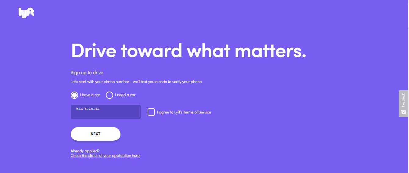
The form asks for certain personal information from the driver. In addition to this, Lyft also has a special feature where the potential driver can put in the State and the number of hours they are willing to drive.
That instantly calculates the potential dollar amount that the driver would be able to make.
These two separate CTA’s take care of the needs of both the kinds of customers – the ones who are ready to register and move ahead and the ones who would still need some time to contemplate and make a decision.
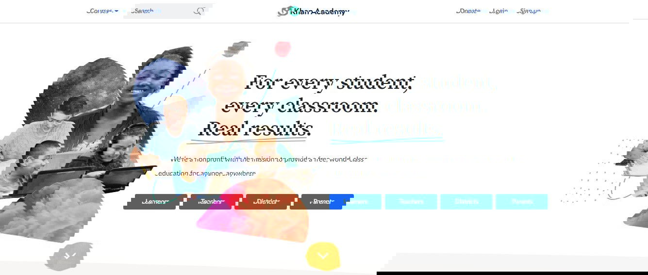
Khan Academy
Khan Academy is another classic example as it makes use of its Homepage itself as the landing page. They have divided the page into four categories: Learners, Teachers, Districts, and Parents.
You can click on the appropriate option and the dedicated CTA takes you straight to a page with all the relevant information.
Taster’s Club
The Taster’s Club landing page calls for two CTA’s – one which will take the potential customer to user testimonials and the other ‘Join Now’ button which will enable the customer to pick his choice of Whiskey.
You can also choose your membership or gifting options and can easily navigate to the checkout page to complete the purchase. Complete ease of use!

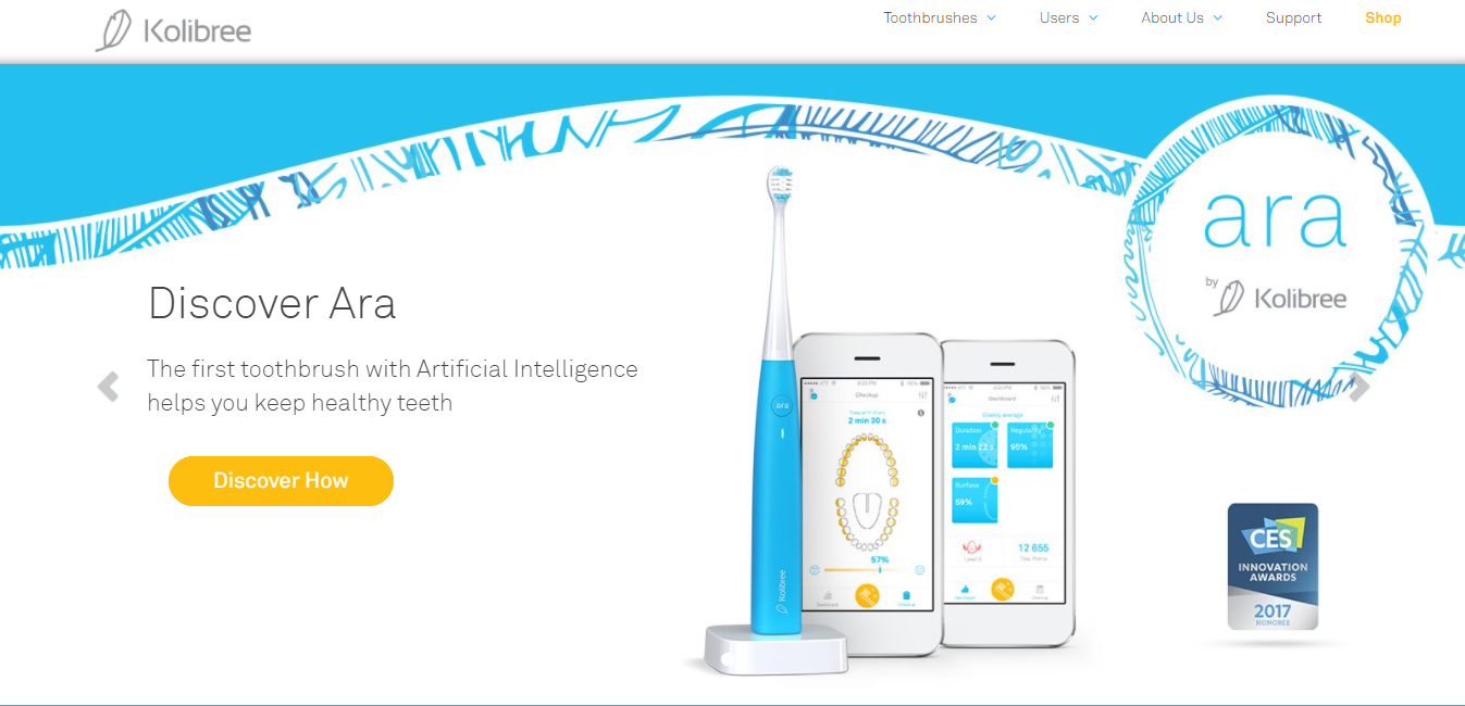
Kolibree – Ara Smart Toothbrush
Kolibree sells smart toothbrushes that use cutting-edge technology to help its customers achieve better oral health while offering a fun and enjoyable experience. On this landing page, they are selling Ara, the first toothbrush with Artificial Intelligence, that gives you a better smile.
There is a UVP located above-the-fold which lets the visitors know what distinguishes the Ara from the other similar toothbrushes. The landing page is aesthetically rich as well.
It features a clean, crisp, uncluttered background along with a beautiful image of the product. As you scroll down, you’ll see more of the same with more other pictures.
Their eCommerce landing page focuses on just one product to optimize conversions and not let the visitors get distracted. Kolibree very well describes the product, highlights its benefits, and even has a video that explains everything about their smart toothbrush.
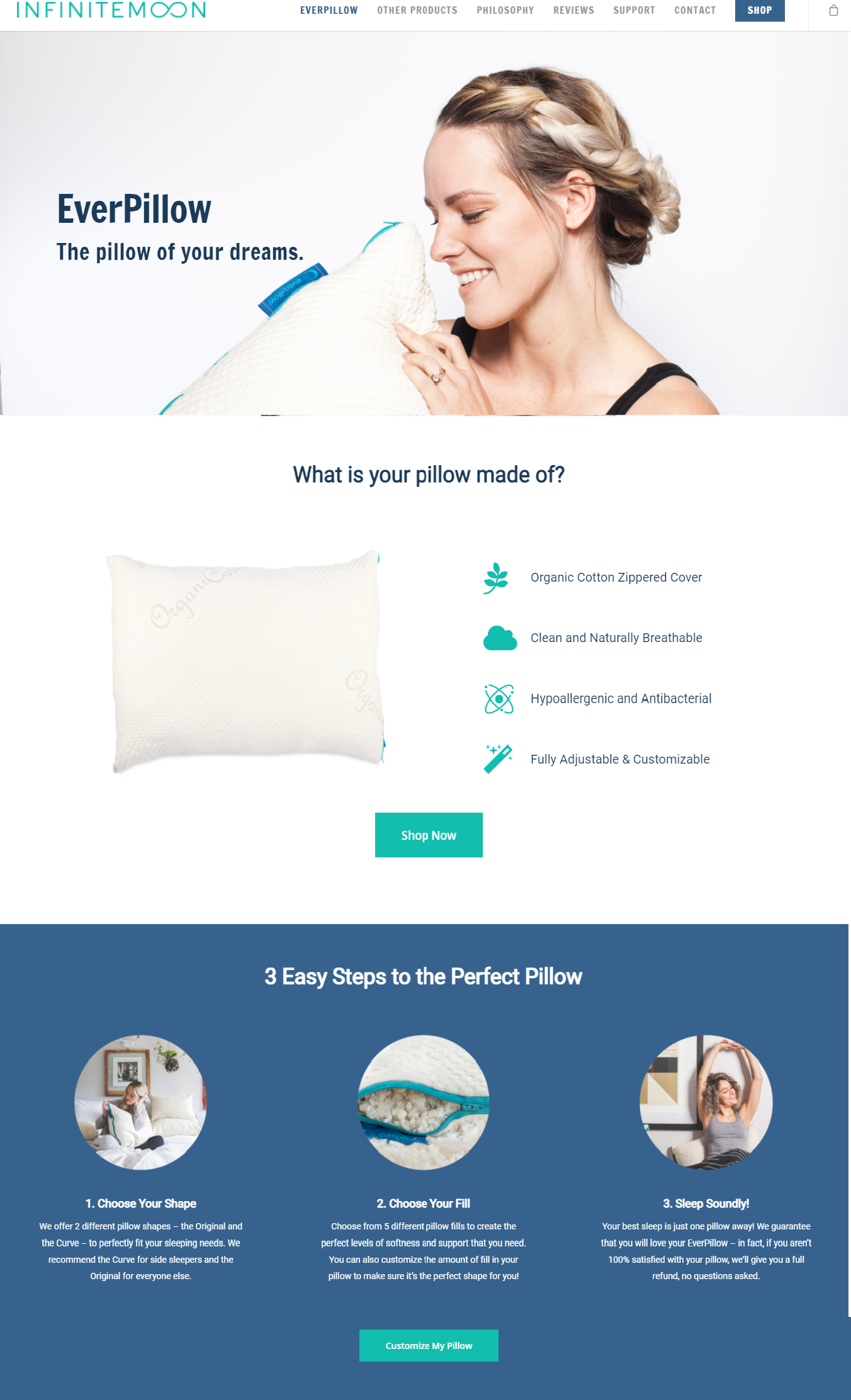
InfiniteMoon – Everpillow
As you scroll down a bit, you will learn about the customizable fill options you can choose from with the Everpillow. The great part about this section is that it gives the visitors an overview of ways in which they can customize their pillow, serving as a UVP simultaneously.
After this, they cover the benefits of the Everpillow and what sets it apart from the regular pillows out there:
- It’s super comfortable.
- It’s clean, cool, chemical-free, and naturally breathable.
- It has a customizable loft and shape.
At the bottom, there’s an unboxing video featuring the founder and president of InfiniteMoon, Steve Van Diest. He educates the shoppers about what to expect from their pillow and how they can remove a part of the pillow filling for optimal comfort.
This video has really helped in boosting their conversions. They even ace the CTA with a simple green button that says, “Sleep Better Today.” The only shortcoming of this eCommerce landing page is not having any social proof like testimonials.
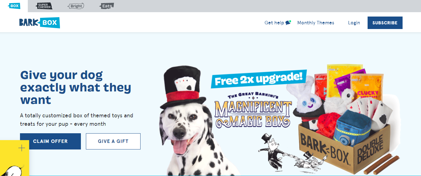
BarkBox
BarkBox offers a monthly subscription box for dogs, that also features a surprise of dog toys, goodies, and treats! Their eCommerce landing page has a clear UVP.
It has a picture of one of the boxes they sell, with an adorable pug that looks absolutely ecstatic about it. It gives its visitors a bird’s eye view of what they’re offering and tells them why it’s interesting.
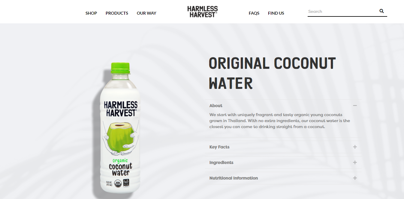
Harmless Harvest – Organic Coconut Water
Harmless Harvest is considered to have one of the most visually attractive eCommerce landing pages.
Like many other smart brands, they use a clean white background, and this minimalist approach helps their product stand out with sharp contrast.
Their approach in describing their product and its ingredients is also very minimalistic. Without scrolling over, the visitor can click and check out their four important sections:
- About
- Key Facts
- Ingredients
- Nutritional Information
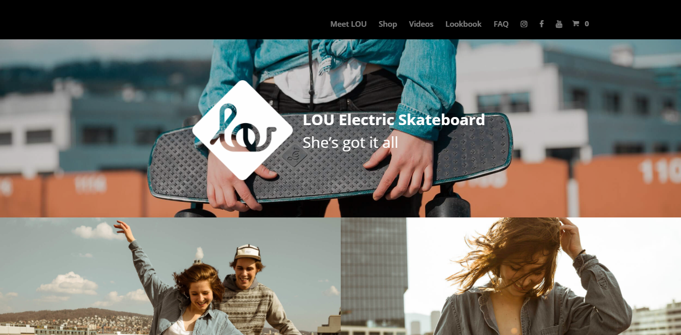
LOU – Electric Skateboard
Lou Board, which makes the “real electric skateboard”, ace their landing page with stunning visuals, a brief overview of what the product is, well-drafted product specifications, and a great UVP.
They also showcase their product’s benefits, also with social proof of their brand’s features on various publications and press. They have even placed the CTA perfectly at the bottom.
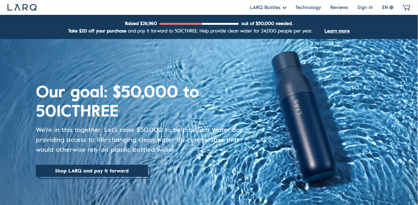
Larq – Portable Self-Cleaning Water Bottle
This eCommerce landing page by Larq strikes the perfect balance between being straightforward and visually appealing. They attract the viewer’s attention with a clean design and a concise headline.
Their color combination is highly appealing and contrasting. They showcase high-quality images featuring the product.
They very efficiently highlight how their bottles can purify water and eradicate 99.99% of bacteria and viruses while being on the go.
Other benefits like how light the bottles are and the long time for which they keep the water hot or cold are very well shown.
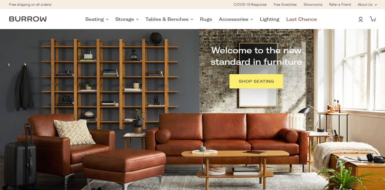
Burrow
Burrow’s landing page makes use of stylish imagery to feature whatever new product they are launching.
The contemporary tone of their eCommerce landing page very well matches the store’s products, and that is what will inevitably resonate with their target audience.
Skullcandy – Mood Boost
The eCommerce landing page for Skullcandy takes their most popular product and offers it with a new perspective. This landing page uses one of the smartest approaches that are there.
Instead of focusing on their headphones or their technical specifications, Skullcandy promotes its mission of mental health awareness. And that is what their landing page, Mood Boost, is about.

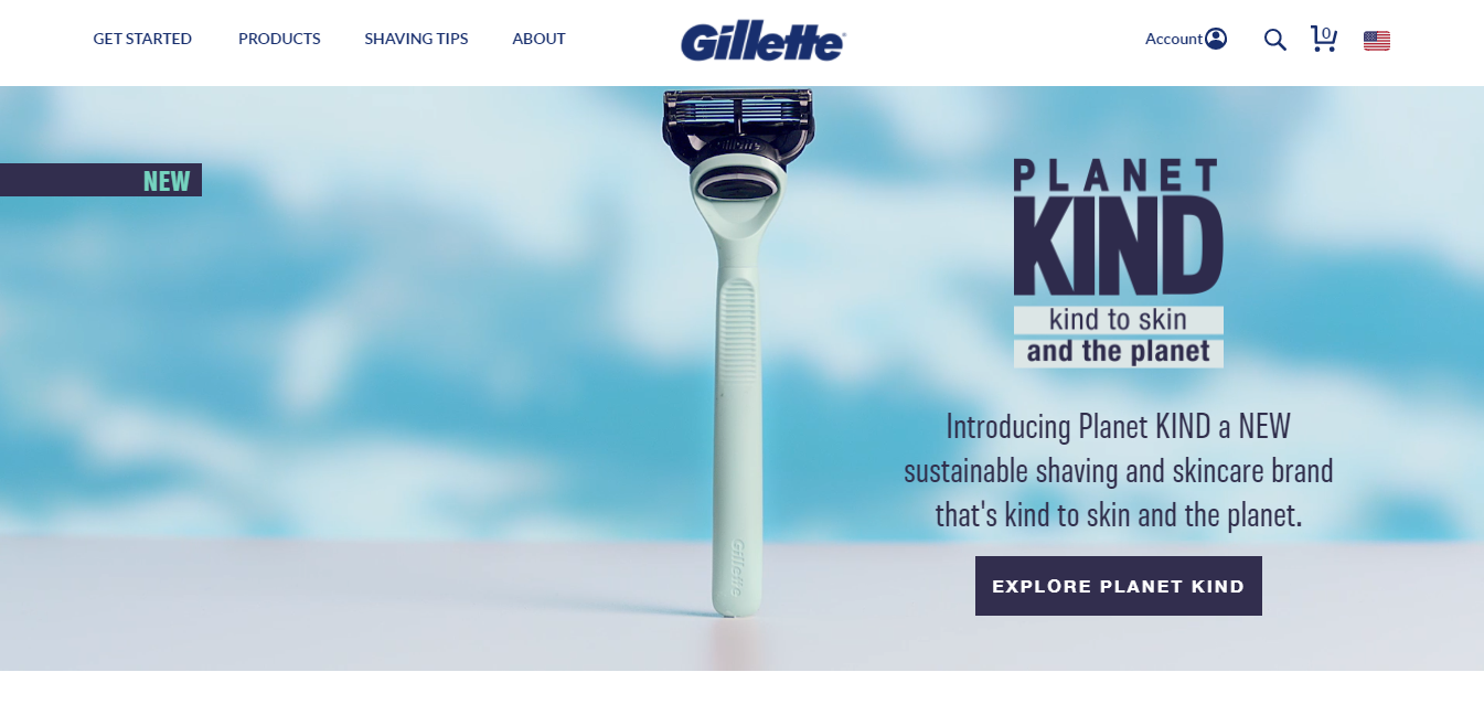
Gillette
Gillette is a well-known brand and its products need no introduction. Hence their approach is to use a rather clean and minimalist design on their landing page to highlight their product.
With just a few words, they are able to convey the offer, and their visitor can see the value propositions like free shipping and cancellation.
They have a strong headline that immediately captures the visitor’s attention.
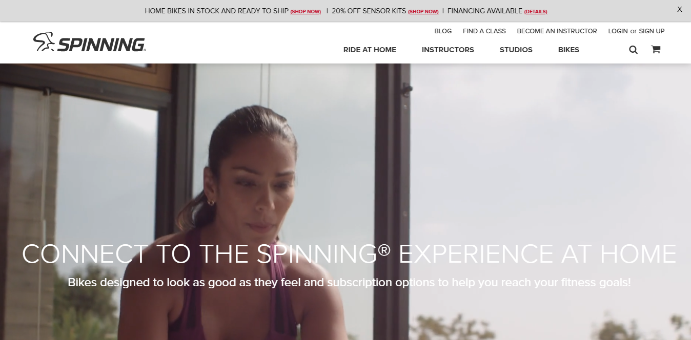
Spinning – Ride At Home
The unique part about Spinning’s landing page is that they show their product in action at the very top of the page. The video is like the first thing you see on the page, and it immediately captivates the visitor’s sight.
As you scroll down, there are different spinning products, with specifications and high-quality images.
Their CTA button in bright color stands out from the rest of the elements on the page.
Their headline “Ride at Home” does a great job in giving the visitors a great idea of how easy it is for them to stay fit at home with Spinning’s products.
5 eCommerce Landing Page Optimization Tactics
1. Write A Compelling Copy
It’s good to craft a great headline and add the perfect image on your eCommerce landing page, but it’s all in vain if what matters is not good enough. Focus on the words that will actually help in selling your CTA.
Your copy needs to be concise, clear, and should successfully guide your visitor to the CTA that you want them to complete.
A compelling copy also speaks directly to the visitors by addressing them as “you” and “your”, giving it a personal touch and making them feel engaged.
2. Add A CTA Button That Stands Out
The most important element of any eCommerce landing page is its CTA. The purpose of your landing page is to make your visitors convert into customers or fulfill any other goal, and that can happen only with the perfect CTA button.
Make sure that the CTA button stands out distinguishably, which you can achieve by using contrasting colors that stand out from the rest of the elements on the page.
You need to be clear about what you want your visitors to do, that is, using an action verb that literally spells it out for them, such as “submit”, “get it now”, “subscribe”, or “download”.
3. Keep Your Offer As Relevant As You Can
Look at your eCommerce landing page as a part of your visitor’s journey where the destination is the ultimate offer, which could be your product or service. Your offer is what you give in exchange for your visitor’s personal information.
Your offer should be two things – compelling enough for your visitor to provide you with their contact info, and highly relevant to your business.
For instance, if you’re in the business of selling horseshoes, here’s what you can do.
You could offer something like “5 easy ways to size your horse’s hooves”, as ultimately you will ask them to buy your horseshoes.
Now say, if you offer them something about organic farming, it would deviate them from the actual goal of buying your horseshoes.
4. Optimize Your Landing Page For Search
One of the most effective ways to drive traffic is through search engines. When looking to optimize your site for generating leads, landing pages are great targets, as a high-ranking eCommerce landing page could drive new leads for your business each month.
After all, that’s the whole purpose of a landing page: to help users that are already looking for your information can find it in a portable and downloadable format.
Make sure that your eCommerce landing page is efficiently optimized for search engines so that when a user searches for something relevant, your page automatically shows up.
5. Make Your Landing Page Responsive
To elevate the visitor’s viewing experience, your eCommerce landing page needs to be responsive just like any other page on your site.
You wouldn’t want your form to fall out of view when a visitor is browsing through your site on their mobile device
Irrespective of how they are viewing your page, give your visitors every reason to convert into your customers.
Mobile optimization, a chat box popup, exit popup, are the kind of things that can make your landing page responsive.
In Conclusion
To wrap up, yes, it is true that every page of the website should be targeted to customer conversion.
And eCommerce landing pages help you understand customer behavior and convert those visitors into leads or customers.
Be sure to build a landing page that is unique to your business needs and meets all your requirements.
Keep testing and keep updating your eCommerce landing pages to keep in pace with the most recent requirements and to keep the glitches in check. Surely, the should ask just one question – “Do you have what I want?”